莱芜文明网,风火靛苑,贵妃天下
官方网址:http://matplotlib.org/tutorials/introductory/lifecycle.html#sphx-glr-tutorials-introductory-lifecycle-py
根据官网描述,matplotlib有两个接口:一个是(object-oriented interfacet)面向对象的接口,用于控制Figure和Axes,它控制一个或多个图形的显示;另一个是pyplot,它是MATLAB的封装,每个Axes是一个依赖于pyplot的独立子图。
1、散点图:最大的作用是查看两个或多个数据的分布情况,可以查看数据的相关性(正相关,负相关),残差分析等。
N = 1000
x = np.random.randn(N)
y = np.random.randn(N) * 0.5 + x
plt.scatter(y, x)
plt.show()
N = 1000
x = np.random.rand(N);y = np.random.rand(N);colors = np.random.rand(N)
area = np.pi * (15*np.random.rand(N)) ** 2
plt.scatter(x, y, s=area, c=colors, alpha=0.5)
plt.show()
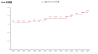
2、折线图:用来描述数据随时间的变化趋势
数据文件https://files.cnblogs.com/files/kuaizifeng/test1data.zip
import time
date, open_price, close_price = np.loadtxt('test1data.csv', delimiter=',', skiprows=1,
                                           usecols=(0, 1, 4),
                                           converters={0: lambda s:time.mktime(time.strptime(str(s, 'utf8'), '%Y/%m/%d'))},
                                           unpack=True)

plt.figure(figsize=(20 ,10))
plt.plot(date, open_price, color='green', marker='<')
plt.plot(date, close_price, color='red', marker='>')
# plt.xticks = [time.strftime('%Y/%m/%d', time.localtime(i)) for i in date]
plt.show()
3、条形图:用于不同分类数据的比较
N = 5
y = [20, 10, 30, 25, 15]
index = np.arange(N)
# plt.bar(left=index, height=y, color='red', width=0.5)#竖直方向
plt.bar(left=0, bottom=index, width=y, color='red', height=0.5, orientation='horizontal')#
# left的是每个数组的左侧坐标点,height是每个条形图的数值
# 快速记忆:left,bottom;width,height是一一对应的关系
plt.show()
# 快速绘制
plt.barh(left=0, bottom=index, width=y)
plt.show()
# 多个条形图
index = np.arange(4)
sales_BJ = [52, 55, 63, 53]
sales_SH = [44, 66, 55, 41]
bar_width = 0.3
plt.bar(left=index, height=sales_BJ, width=bar_width, color='b')
plt.bar(left=index+bar_width, height=sales_SH, width=bar_width, color='r')
plt.show()
# 堆积条形图
index = np.arange(4)
sales_BJ = [52, 55, 63, 53]
sales_SH = [44, 66, 55, 41]
bar_width = 0.3
plt.bar(left=index, height=sales_BJ, width=bar_width, color='b')
plt.bar(left=index, bottom=sales_BJ, height=sales_SH, width=bar_width, color='r')
plt.show()
# 横向堆积条形图
index = np.arange(4)
sales_BJ = [52, 55, 63, 53]
sales_SH = [44, 66, 55, 41]
bar_width = 0.3
plt.barh(left=0, bottom=index, height=bar_width, width=sales_BJ, color='b')
# 当然用orientation='horizontal'也是可以的
plt.barh(left=sales_BJ, bottom=index, height=bar_width, width=sales_SH, color='r')
plt.show()
4、直方图:有一系列高度不等的条形图组成,用来表示连续型数据分布情况
# 正态分布直方图
mean = 100# mean of distribution
sigma = 20# standard of distribution
x = mean + sigma*np.random.randn(10000)
plt.hist(x, bins=50, color='green', normed=True)
# bins:在直方图里设置多少个条块;normed:是否标准化;没有标准化时纵坐标是‘个数’,标准化后纵坐标是‘频率’
plt.show()
# 双变量直方图:用来探索双变量的联合分布情况
x = np.random.randn(1000) + 2
y = np.random.randn(1000) + 3
plt.hist2d(x, y, bins=40)
plt.show()
5、饼状图:用来显示一系列数据内各组数据的占比大小
labels = 'a', 'b', 'c', 'd'
fracs = [15,30, 45, 10]
# plt.axes(aspect=1)# 控制饼状图的比例:1表示正圆
plt.pie(x=fracs, labels=labels, autopct='%0.0f%%', explode=[0.1, 0., 0., 0.], shadow=True)
# autopct:显示比例;explode:每个饼块里圆心的距离;添加阴影效果
plt.show()
6、箱线图:用于显示数据的集中和离散情况,以及检测异常值
np.random.seed(100)
data = np.random.normal(size=1000, loc=0, scale=1)
plt.boxplot(data, sym='o', whis=1.5)
# sym:用来调整异常值的形状;whis:异常值的界限,默认是1.5倍四分位距
plt.show()
# 绘制多个箱线图
np.random.seed(100)
data = np.random.normal(size=(1000, 4), loc=0, scale=1)
labels=['a', 'b', 'c', 'd']
plt.boxplot(data, labels=labels, sym='o', whis=1.5)
plt.show()
# 八中内建颜色:blue、green、red、cyan、magenta、yellow、black、white;默认按这个顺序画多个图形
# 其它颜色表示方法:灰色阴影、html十六进制、RGB元组
# 点的形状23种
potstyle = ['.', ',', 'o', 'v', '^', '<', '>', '1', '2', '3', '4', '8', 's', 'p', '*',
           'h', 'H', '+', 'X', 'D', 'd', '|', '-']
# 四种线型
linestyle = ['-', '--', '-.', ':']
# 样式字符串就是三种样式的简写方式,对应颜色、点、线型
# 示例
y = np.arange(1, 5) + 1
marker = ['b', 'g', 'r', 'c', 'm', 'y', 'b', 'w']
for i in range(8):
    plt.plot(y+i, marker[i])
plt.show()
y = np.arange(1, 5)
plt.plot(y, color='g')#内置颜色
plt.plot(y+1, color='0.5')#回影颜色
plt.plot(y+2, color='#FF00FF')#十六进制表示法
plt.plot(y+3, color=(0.1, 0.2, 0.3))#RGB元组表示
plt.show()
y = np.arange(1, 5)
plt.plot(y, marker='o')#指定marker时划线
plt.plot(y+1, 'D')#不指定marker时划点
plt.plot(y+2, '^')
plt.plot(y+3, marker='p')
plt.show()
# 样式
y = np.arange(1, 5)
plt.plot(y, 'cx--')
plt.plot(y+1, 'kp:')
plt.plot(y+2, 'mo-.')
plt.show()
三种绘图方式:
1.pyplot:经典高层封装;
2.pylab:将matplotlib和Numpy合并的模块,模拟matplab的编程环境;不推荐使用,作者也不推荐使用;
3.面向对象的方式:matplotlib的精髓,更基础和底层的方式.
1、画布与子图
figure对象是画布,Axes对象是画布里的子图
# 绘制多个图
fig1 = plt.figure()
ax1 = fig1.add_subplot(111)
ax1.plot([1, 2, 3], [3, 2, 1])
fig2 = plt.figure()
ax2 = fig2.add_subplot(111)
ax2.plot([1, 2, 3], [1, 2, 3])
plt.show()
# 一张图里放多个子图
x = np.arange(1, 100)
fig = plt.figure()
ax1 = fig.add_subplot(221);ax1.plot(x, x)# plt.subplot(221)
ax2 = fig.add_subplot(222);ax2.plot(x, -x)
ax3 = fig.add_subplot(223);ax3.plot(-x, x)
ax4 = fig.add_subplot(224);ax4.plot(-x, -x)
plt.show()
2、网格线
y = np.arange(1, 10)
plt.plot(y, y**2)
plt.grid(color='r', linewidth='0.5', linestyle=':')#网格
plt.show()
3、图例
x = np.arange(1, 11, 1)
plt.plot(x, x**2, label='Normal')#在图形中写上线的标签
plt.plot(x, x**3, label='Fast')
plt.plot(x, x**4, label='Fastest')
plt.legend(loc=1, ncol=3)
#1,2,3,4表示右上、左上、左下、右下.0表示自动.ncol表示几列.
plt.show()
x = np.arange(1, 11, 1)
plt.plot(x, x**2, label='Normal')#在图形中写上线的标签
plt.plot(x, x**3, label='Fast')
plt.plot(x, x**4, label='Fastest')
plt.legend(['Normal', 'Fast', 'Fastest'], loc='upper right')
#1,2,3,4表示右上、左上、左下、右下.0表示自动.ncol表示几列.
plt.show()
x = np.arange(1, 11, 1)
fig = plt.figure();ax = fig.add_subplot(111);
l, = plt.plot(x, x**2);l.set_label('Normal set')#设置label
ax.legend(loc=1)#注意这里的ax
plt.show()
4、坐标轴
# 设置坐标轴范围
x = np.arange(-10, 11, 1)
fig = plt.figure();ax = fig.add_subplot(111);
ax.plot(x, x*x)
print(ax.axis())#[-11, 11, -5, 105]表示的是x的最小和最大值、y的最小和最大值
ax.axis([-5, 5, 0, 25])#设置坐标轴范围方式
plt.show()
# 设置坐标轴范围
x = np.arange(-10, 11, 1)
fig = plt.figure();ax = fig.add_subplot(111);
ax.plot(x, x*x)
ax.set_xlim([-5, 5])#以列表的方式些参数
ax.set_ylim(ymin=-5, ymax=50)#以关键字参数的方式写参数
plt.show()
# 添加坐标轴
x = np.arange(2, 20, 1)
y1 = x*x;y2 = np.log(x)
plt.plot(x, y1)
plt.twinx()#添加x坐标轴,默认是0到1
plt.plot(x, y2, 'r')#第二条线就直接画在twinx上了?
plt.show()
# 添加坐标轴
x = np.arange(2, 20, 1)
y1 = x*x;y2 = np.log(x)
fig = plt.figure(); ax1 = fig.add_subplot(111)
ax1.plot(x, y1);ax1.set_ylabel('Y1')
ax2 = ax1.twinx(); #实例化一个子图ax1,添加坐标轴是这个子图的一个方法
ax2.plot(x, y2, 'r');ax2.set_ylabel('Y2')
ax1.set_xlabel('Compare Y1 and Y2')
plt.show()
# 当然,有twinx(),就有twiny()
5、注释
# 添加注释:为了给某个数据添加强调效果
x = np.arange(-10, 11, 1)
plt.plot(x, x*x)
plt.annotate('this is the bottom', xy=(0,1), xytext=(0,20),
            arrowprops=dict(facecolor='c', width=50, headlength=10, headwidth=30))# 文本内容;箭头坐标;文本内容坐标;箭头设置:
plt.show()
# 纯文字标注
x = np.arange(-10, 11, 1)
plt.plot(x, x*x)
plt.text(-4.5, 40, 'function:y=x*x', family='serif', size=20, color='r')
plt.text(-4, 20, 'function:y=x*x', family='fantasy', size=20, color='g')
plt.text(-4, 60, 'fuction:y=x*x', size=20, style='italic', weight=1000,
         bbox=dict(facecolor='g'), rotation=30)
#style:italic和oblique都是斜体;weight是粗细0-1000,或者写名称
# bbox给text加上边缘效果设置,还有其它的参数;text还有水平线、竖直线等等;arrowprops也还有其它的效果参数
plt.show()
6、数学公式
matplotlib自带mathtext引擎,遵循Latex排版规范。$作为开头和结束符,如"$ y=x**2 $";特殊表达式和字符前面要加"\";公式里的参数设置,要以{}括起来。
fig = plt.figure();ax = fig.add_subplot(111);
ax.set_xlim([1, 7])
ax.set_ylim([1, 5])
ax.text(2, 4, r'$ \alpha_i \beta \pi \lambda \omega $', size=20)
# 下标用_i
ax.text(4, 4, r'$ \sin(x) = \cos(\frac{\pi}{2}) $', size=20)
# \frac{}{},分式:分子/分母
ax.text(2, 2, r'$ \lim_{x \rightarrow y} (\frac{1}{x^3}) $', size=20)
ax.text(4, 2, r'$ \sqrt[4]{4x}{4x} = \sqrt{y} $', size=20)
# sqrt开方的参数是[]
plt.show()
1、fill和fill_between
x = np.linspace(0, 5*np.pi, 1000);y1 = np.sin(x); y2 = np.sin(2*x)
# plt.plot(x, y1); plt.plot(x, y2)
# 不写plot,是因为它画了线
plt.fill(x, y1, 'b', alpha=0.3);plt.fill(x, y2, 'r', alpha=0.3)#填充的是图形与x轴之间的区域
plt.show()
x = np.linspace(0, 5*np.pi, 1000);y1 = np.sin(x); y2 = np.sin(2*x)
fig = plt.figure();ax = fig.add_subplot(111)
ax.plot(x, y1, 'r', x, y2, 'b')
ax.fill_between(x, y1, y2, facecolor='yellow', interpolate=True)
ax.fill_between(x, y1, y2, where=y1>y2, facecolor='green', interpolate=True)
# 放大时会出现空白,interpolate是把空白填上
plt.show()
2、patches:补丁
import matplotlib.patches as mpatches
fig, ax = plt.subplots()
# 圆形
xy1 = np.array([0.2, 0.2])
circle = mpatches.Circle(xy1, 0.05)#第一个参数是xy1圆心,第二个参数是半径
ax.add_patch(circle)
# 长方形
xy2 = np.array([0.2, 0.8])
rect = mpatches.Rectangle(xy2, 0.2, 0.1, color='r')#第一个参数是矩形右下角,第二个和第三个参数是宽和高
ax.add_patch(rect)
# 多边形
xy3 = np.array([0.8, 0.2])
polygon = mpatches.RegularPolygon(xy3, 6, 0.1, color='g')#多边形中心、边数、半径
ax.add_patch(polygon)
# 椭圆
xy4 = np.array([0.8, 0.8])
ellipse = mpatches.Ellipse(xy4, 0.4, 0.2, color='y')
ax.add_patch(ellipse)
plt.axis('equal')#调整x,y的显示比例
plt.grid()
plt.show()
# 还有其它的图形,参考matplotlib官网的patches模块说明
def plot(style):
    fig, axes = plt.subplots(ncols=2, nrows=2)
    ax1, ax2, ax3, ax4 = axes.ravel()
    # 选择绘图样式
    plt.style.use(style)
    # 第一张图
    x, y = np.random.normal(size=(2, 100))
    ax1.plot(x, y, 'o')
    # 第二张图
    x = np.arange(0, 10);y = np.arange(0, 10)
    ncolors = len(plt.rcParams['axes.prop_cycle'])
    # plt.rcParams['axes.prop_cycle'] #默认是七种颜色
    shift = np.linspace(0, 10, ncolors)
    for s in shift:
        ax2.plot(x, y+s, '-')
    # 第三张图
    x = np.arange(5)
    y1, y2, y3 = np.random.randint(1, 25, size=(3,5))
    width=0.25
    ax3.bar(x, y1, width);
    ax3.bar(x+width, y2, width, color=list(plt.rcParams['axes.prop_cycle'])[1]['color'])
    ax3.bar(x+2*width, y3, width, color=list(plt.rcParams['axes.prop_cycle'])[2]['color'])
    # 第四张图
    for i in list(plt.rcParams['axes.prop_cycle']):
        xy = np.random.normal(size=2)
        ax4.add_patch(plt.Circle(xy, radius=0.3, color=i['color']))
    ax4.axis('equal')

    plt.show()
# 注:plt.rcParams['axes.prop_cycle']是一个七种颜色的迭代器
# list之后是[{'color':'#ff7f0e', ... },...],再根据位置和键'color'取值
# print(plt.style.available)# 23种样式可供选择
plot(style='dark_background')
plot(style='ggplot')
plot(style='fivethirtyeight')
r = np.arange(1, 6, 1)
theta = [0, np.pi/2, np.pi, np.pi*3/2, 2*np.pi]
ax = plt.subplot(111, projection='polar')# 投影到极坐标
ax.plot(theta, r, color='r', linewidth=3)
plt.show()
r = np.empty(5)
r.fill(5)
theta = [0, np.pi/2, np.pi, np.pi*3/2, 2*np.pi]
ax = plt.subplot(111, projection='polar')
ax.plot(theta, r, color='r', linewidth=3)
plt.show()
r = [10.0, 8.0, 6.0, 8.0, 9.0, 5.0, 9.0]
theta = [(np.pi*2/6)*i for i in range(7)]
ax = plt.subplot(111, projection='polar')
bars = ax.bar(theta, r, linewidth=2)
for color, bar in zip(list(plt.rcParams['axes.prop_cycle']), bars):
    bar.set_facecolor(color['color'])
    bar.set_alpha(0.7)
ax.set_theta_direction(1)#方向,1表示顺时针,2表示逆时针
ax.set_theta_zero_location('N')#极坐标0位置,默认是横坐标,可设置八个方向N,NW,W,SW,S,SE,E,NE
ax.set_thetagrids(np.arange(0.0, 360.0, 30.0))#外圈网格线刻度
ax.set_rgrids(np.arange(1.0, 10.0, 1.0))#内网格线虚线数
ax.set_rlabel_position('0')#内网格线坐标标签的位置,相对于0坐标轴
plt.show()
1、积分图形
def func(x):
    return -(x-2)*(x-8) + 40
x = np.linspace(0, 10)
y = func(x)
fig, ax = plt.subplots()
plt.style.use('ggplot')
plt.plot(x, y, 'r', linewidth=1)
# 添加a, b
a, b =2, 9
ax.set_xticks([a, b])
ax.set_yticks([])
ax.set_xticklabels([r'$a$', r'$b$'])
# 添加坐标标签
plt.figtext(0.9, 0.02, r'$x$')
plt.figtext(0.05, 0.9, r'$y$')
# 设置N*2的array,用Polygon包起来
ix = np.linspace(a, b);iy = func(ix);ixy = zip(ix, iy)
verts=[(a, 0)] + list(ixy) + [(b, 0)]
from matplotlib.patches import Polygon
poly = Polygon(verts, facecolor='0.9', edgecolor='0.1')#'0.9'表示默认是灰色的,调整灰色程度
ax.add_patch(poly)

x_math=(a+b)*0.5;y_math=35
plt.text(x_math, y_math, r'$ \int_a^b (-(x-2)*(x-8) + 40) dx $', fontsize=20,
        horizontalalignment='center')
ax.set_ylim([25, 50])
plt.show()
2、散点和条形图
x = np.random.randn(200);y = x+np.random.randn(200)*1.0
#left, bottom, width, height
ax1 = plt.axes([0.1, 0.1, 0.6, 0.6])
ax2 = plt.axes([0.1, 0.1+0.6+0.02, 0.6, 0.2])
ax3 = plt.axes([0.1+0.6+0.02, 0.1, 0.2, 0.6])
ax2.set_xticks([])
ax3.set_yticks([])
xymax = np.max([np.max(np.fabs(x)), np.max(np.fabs(y))])

ax1.scatter(x, y)
bin_width = 0.25
lim = np.ceil(xymax/bin_width) * bin_width
bins = np.arange(-lim, lim, bin_width)
ax2.hist(x, bins=bins)
ax3.hist(y, bins=bins, orientation='horizontal')
ax2.set_xlim(ax2.get_xlim())
ax3.set_ylim(ax3.get_ylim())
plt.show()

3、雷达图
from matplotlib.font_manager import FontProperties
font = FontProperties(fname=r'c:/Windows/Fonts/simsun.ttc', size=18)
plt.style.use('ggplot')
ax1 = plt.subplot(221, projection='polar')
ax2 = plt.subplot(222, projection='polar')
ax3 = plt.subplot(223, projection='polar')
ax4 = plt.subplot(224, projection='polar')

ability = ['进攻', '防守', '盘带', '速度', '体力', '射术']
playerName = ['M', 'H', 'P', "Q"]
playerData = {}
for i in range(4):
    data = list(np.random.randint(size=6, low=60, high=99))
    l = [j for j in data];l.append(data[0])
    playerData[playerName[i]] = l
theta = [(2*np.pi/6)*i for i in range(7)]

ax1.plot(theta, playerData['M'], 'r')
ax1.fill(theta, playerData['M'], 'r', alpha=0.2)
ax1.set_xticks(theta)
ax1.set_xticklabels(ability, FontProperties=font, y=0.3)
ax1.set_title('梅西', position=(0.5, 0.4), FontProperties=font)
ax1.set_yticks([60, 80, 100])
ax2.plot(theta, playerData['H'], 'g')
ax2.fill(theta, playerData['H'], 'g', alpha=0.2)
ax2.set_xticks(theta)
ax2.set_xticklabels(ability, FontProperties=font, y=0.3)
ax2.set_title('哈维', position=(0.5, 0.4), FontProperties=font)

ax3.plot(theta, playerData['P'], 'b')
ax3.fill(theta, playerData['P'], 'b', alpha=0.2)
ax3.set_xticks(theta)
ax3.set_xticklabels(ability, FontProperties=font, y=0.3)
ax3.set_title('皮克', position=(0.5, 0.4), FontProperties=font)

ax4.plot(theta, playerData['Q'], 'y')
ax4.fill(theta, playerData['Q'], 'y', alpha=0.2)
ax4.set_xticks(theta)
ax4.set_xticklabels(ability, FontProperties=font, y=0.3)
ax4.set_title('切赫', position=(0.5, 0.4), FontProperties=font)
plt.show()

4、函数曲线
Figure的几个参数:
num 图形
figsize 尺寸
dpi 每英寸点数分辨率
facecolor 绘画背景颜色
edgecolor 绘制背景周围的边缘颜色
frameon 是否绘制图形框
import numpy as np
import matplotlib.pyplot as plt

plt.figure(figsize=(10,6),dpi=80)

X = np.linspace(-np.pi,np.pi,256,endpoint=True)
C,S = np.cos(X),np.sin(X)

#设置数据线
plt.plot(X,C,color='blue',lw=2.5,ls='-',label='cosine')#设置数据线
plt.plot(X,S,color='red',lw=2.5,ls='-',label='sine')
# plt.xlim(X.min()*1.1,X.max()*1.1)#这里一直报错,不知道为什么
# plt.ylim(C.min()*1.1,X.max()*1.1)

#设置坐标刻度和刻度标签
# plt.xticks([-np.pi,-np.pi/2,0,np.pi/2,np.pi]) #设置x,y坐标
# plt.yticks([-1,0,+1])
plt.xticks([-np.pi,-np.pi/2,0,np.pi/2,np.pi],[r'$-\pi$',r'$-\pi/2$',r'$0$',r'$+\pi/2$',r'$+\pi$'])
plt.yticks([-1,0,+1],[r'$-1$',r'$0$',r'$+1$'])

#设置坐标轴
ax = plt.gca()  #gca是用来回去当前axes(坐标图)和修改权限:get current axes(handle)
ax.spines['top'].set_color('none')           #设置上、右脊骨(数据框)
ax.spines['right'].set_color('None')
ax.spines['left'].set_position(('data',0))   #左、下数据轴,(data’,0)表示以原坐标轴为轴,以0为中心点
ax.spines['bottom'].set_position(('data',0))
ax.yaxis.set_ticks_position('left')       #这两个才是设置坐标轴,但是在这里删掉都可以
ax.xaxis.set_ticks_position('bottom')

#设置图例
plt.legend(loc='upper left',frameon=False)#需在plt.plot中设置label

#设置注释
t = 2*np.pi/3
# t1 = np.sin(t)
plt.scatter([t,],[np.sin(t),],50,color='red')                                  #设置注释点位置、颜色
plt.plot([t,t],[0,np.sin(t)],color="red",linewidth=1.5,linestyle="--")         #设置两条虚线
plt.plot([0,t],[np.sin(t),np.sin(t)],color="red",linewidth=1.5,linestyle="--")
plt.annotate(r'$\sin(\frac{2\pi}{3})=\frac{\sqrt{3}}{2}$',
             xy=(t,np.sin(t)),xycoords='data',xytext=(+10,+50),
             textcoords='offset points',fontsize=16,
             arrowprops=dict(arrowstyle='->',connectionstyle='arc3,rad=.2'))  #设置注释
plt.scatter([t,],[np.cos(t),],50,color='blue')
plt.plot([t,t],[0,np.cos(t)],color='blue',linewidth=1.5,linestyle='--')
plt.plot([0,t],[np.cos(t),np.cos(t)],color='blue',lw=1.5,ls='--')
plt.annotate(r'$\cos(\frac{2\pi}{3})=-\frac{1}{2}$',
             xy=(t,np.cos(t)),xycoords='data',xytext=(-90,-50),
             textcoords='offset points',fontsize=16,
             arrowprops=dict(arrowstyle='->',connectionstyle='arc3,rad=.2'))

#设置坐标轴和数据线重合处的显示
for label in ax.get_xticklabels()+ax.get_yticklabels():
    label.set_fontsize(16)
    label.set_bbox(dict(facecolor='white',edgecolor='None',alpha=0.65))
#保存图形
# plt.savefig('.../figures/subplot-horizontal.png',dpi=64)
plt.show()

如对本文有疑问,请在下面进行留言讨论,广大热心网友会与你互动!! 点击进行留言回复

Python 实现将numpy中的nan和inf,nan替换成对应的均值
python爬虫把url链接编码成gbk2312格式过程解析
网友评论