好纳思,xia,电贸通
安装数据可视化模块matplotlib:pip install matplotlib
导入matplotlib模块下的pyplot
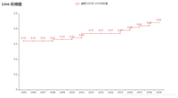
1 折线图
from matplotlib import pyplot
#横坐标
year=[2010,2012,2014,2016]
#纵坐标
perple=[20,40,60,100]
#生成折线图:函数polt
pyplot.plot(year,perple)
#设置横坐标说明
pyplot.xlabel('year')
#设置纵坐标说明
pyplot.ylabel('population')
#添加标题
pyplot.title('population year correspondence')
#设置纵坐标刻度
pyplot.yticks([0, 25, 50, 75, 90])
# 显示网格
pyplot.grid(true)
显示图表
pyplot.show()

2 散点图
用两种方法
第一种:只需将函数polt换成scatter即可.
from matplotlib import pyplot
#横坐标
year=[2010,2012,2014,2016]
#纵坐标
perple=[20,40,60,100]
#生成散点图:函数scatter
pyplot.scatter(year,perple)
#设置横坐标说明
pyplot.xlabel('year')
#设置纵坐标说明
pyplot.ylabel('population')
#添加标题
pyplot.title('population year correspondence')
#设置纵坐标刻度
pyplot.yticks([0, 25, 50, 75, 90])
# 显示网格
pyplot.grid(true)
显示图表
pyplot.show()

第二种方法:在polt函数里添加第三个参数 “o”.
可以更改点的颜色和类型,如红色,五角型:把plot第三个参数改为'rp'.
#点的颜色
#线的类型
#点的类型
from matplotlib import pyplot
#横坐标
year=[2010,2012,2014,2016]
#纵坐标
perple=[20,40,60,100]
#生成散点图:函数polt
pyplot.plot(year,perple,'rp')
#设置横坐标说明
pyplot.xlabel('year')
#设置纵坐标说明
pyplot.ylabel('population')
#添加标题
pyplot.title('population year correspondence')
#设置纵坐标刻度
pyplot.yticks([0, 25, 50, 75, 90])
# 显示网格
pyplot.grid(true)
显示图表
pyplot.show()

总结
以上就是这篇文章的全部内容了,希望本文的内容对大家的学习或者工作具有一定的参考学习价值,谢谢大家对移动技术网的支持。如果你想了解更多相关内容请查看下面相关链接
如对本文有疑问,请在下面进行留言讨论,广大热心网友会与你互动!! 点击进行留言回复

Python 实现将numpy中的nan和inf,nan替换成对应的均值
python爬虫把url链接编码成gbk2312格式过程解析
网友评论